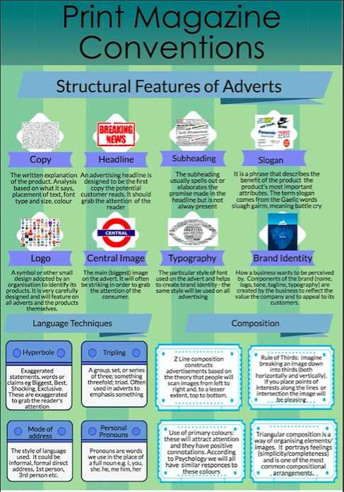

Analysis of the print advert
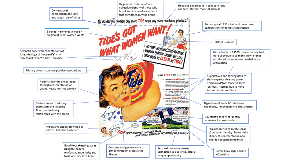
Due to the Z-shaped composition, the first thing the audience will read is the subheading; where direct address is also used to attract their audience further. The hegemonic code reinforces collective identity of those who buy it and assumed acceptance that all women buy the brand. This then further causes women to feel as if they have to follow what every other women does and buy Tide; as the company have clearly made it appear like every women purchases this product. These headings and slogans are also seen to be in an informal font; this helps the audience to feel familiarity and disallows the poster to intimidate the audience.
However, the rather large sum of copy at the side of the poster is written in more of a formal font so that it can go alongside the information provided. The information that they have stated is made out like it is all factual even though there is no evidence to support this. This helps the selling point of the product as it seemingly is safe and does everything that it states it does; it also provides reassurance to those women who are reading this and potentially purchasing it.
Superlatives and tripling are used in this same piece of text to show superior cleaning power. It also highlights all of the great things that Tide is meant to do. The use of the noun 'miracle' is clearly a hyperbole which helps give the sense of superiority and effectiveness.
The small image at the edge of the poster reinforces the idea of familiarity for the audience; as it is a typical sense that these women would most likely face on a daily basis.
The costume and gesture of the central image of the empowered women represents the arm gesture of Rosie the Riveter. This can empower women even if it still represents that they are in charge of the domestics. Moreover, linking in further with the war and how women were allowed to be apart of the war effort.
Towards the bottom of the poster is the certificate of Good Housekeeping Act, reassuring the audience of the trust-worthiness of the brand and of its superiority.
The central image, furthermore, represents the gestures of hugging and adoring the product- just like those who are going to go on and buy the product. Also connoting the loving relationship with the brand. This will clearly further convince the audience to purchase the product and recommend to others.
As this advert is obviously directed at women, the producers of this poster have used what would be called a fashionable and trendy women- at that time- to represent a young, newly married women as a part of the central image.
Due to this poster being produced in the 1950s, they have included a lot more information than what you would expect now. This is due to the post-WWII consumer boom of the 1950s as there was a rapid development of new technologies for the home, designed to make domestic chores easier. It also was a time when the public realised their worth and demanded an increase in their standards of living, So, a poster had to include a lot of information to really engage those viewing it and to express how much better their product is than any other.
Theories
Gauntlett
-The media provide us with ‘tools’ or resources that we use to construct our identities.Women represented in the advert act as role models of domestic perfection that the audience may want to construct their own sense of identity against.
Feminism- Van Zoonen
- Gender is constructed through the copy and that its meaning varies according to cultural and historical context. While their role socially and politically may have changed in the years after the war, the advert perhaps contradicts Van Zoonen’s theory that the media contribute to social change, by representing women in non-traditional roles and using non-sexist language.
Feminism- hooks
- hooks also considered that race and class, as well as gender, determine the extent to which individuals are exploited, discriminated against or oppressed.
-Argues that lighter skinned women are considered more desirable and fit better into the western ideal of beauty, and the advert could be seen to reinforce this by only representing “modern”, white women. This could also be linked to Gilroy’s ethnicity and post-colonial theories that media texts reinforce colonial power. Contextually, this power has perhaps been challenged at this moment in American history by the events of WWII.
Representation- Hall
- Representation is the production of meaning through the signs in a text. Representation, reduces people to a few simple characteristics or traits. The images of domesticity- despite the construction of the comic strip- the scenario represented is familiar to the audience as a representation of their own lives.
Gilroy
- media texts reinforce colonial power. For connections with the poster look in Hooks theory due to there being links/similarities.
Semiotics- Roland Barthes
-Suspense is created through the enigma of “what women want"and emphasised by the use of tension building with multiple exclamation marks (Barthes’ Proairetic Code).
• Barthes’ Semantic Code could be applied to the use of hearts above the main image. The hearts and the woman’s gesture codes have connotations of love and relationships. It’s connoted that this is “what women want” as well as by having a clean home.
Structuralism – Claude Lévi-Strauss
-Whereby texts are constructed through the use of binary oppositions, and meaning is made by audiences understanding these conflicts.
• In this text, “Tide gets clothes cleaner than any other wash-day product you can buy!” and “There’s nothing like Procter and Gamble’s Tide”, reinforces the conceptual binary opposition between Tide and its commercial rivals.
• It’s also “unlike soap,” gets laundry “whiter… than any soap or washing product known” and is “truly safe” – all of which connotes that other, inferior products do not offer what Tide does.
Cultivation Theory- George Gerbner
Advertising developed significantly during the 1950s and this theory, developed by Gerbner in the early 1970s, explains some of the ways in which audiences may be influenced by media texts such as adverts.
The Tide advert aims yo cultivate the ideas that: this is the brand leader; nothing else washes to the same standard as Tide; it's a desirable product for its "miracle suds" are an innovation for the domestic washing market. Gerbner's theory would argue that the repetition..