JESSIE J official website
homepage
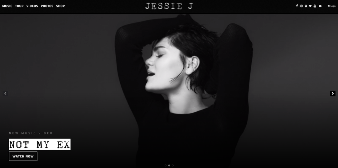
- From the first viewing of the website it is clear that her page is very modern and that is rather formal.
- Her work as an artist has clearly changed over time as her most recent songs have sadder tone to them. The songs are not as upbeat as her first hits were, which is evident with the design of the website and the images shown.
- The imagery that is shown in this screenshot and that is firstly viewed by the audience, is in fact a part of her music video for the song that is stated in the bottom left corner. These moving visuals help to promote her new singles and also allows easy access for her fans/viewers to access the full music videos on YouTube; so is a quick link.
- There are also quick links to her social medias in the corner of every page. This helps to promote her social medias more; which allow her fans to follow her day-to-day life.
- The whole of the website is designed in a black and white colour palette. Although this may seem dull and depressing initially, it actually produces a more sophisticated look and pulls the whole website together to make it look more formal and suited to Jessie J's new style of music.
TOUR PAGE
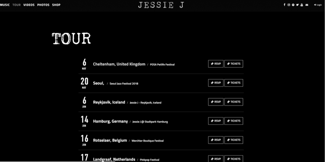
- She has a page specifically aimed at her tour- the dates of the tour and where the specific performance will be.
- There is also a direct link to buy tickets for the tour which helps to boost her marketing. The quick links will mean the viewers will be more inclined to buy a ticket as there is easier access and it is quicker to find one.
shop
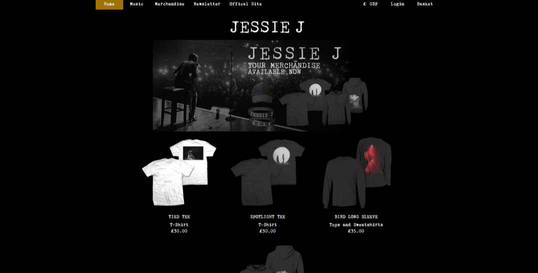
- Jessie J has a page directed at selling her merchandise, this will help to boost her sales of her products as they are more accessible.
overall website
- The overall website lacks colour and is rather dull.
- It is also very minimalistic and is rather plain and simple.
- There is also a lack of any large texts of writing and the website doesn't contain a lot of information.
